Logo Refresh
EDF's legacy logo wasn't built for the digital age — too detailed for social use, with a tagline that couldn't translate online. When the rebrand stalled over logo color approvals, my solution was to ground the new mark in EDF's heritage colors: the blues and greens echoing the elements of nature it aims to protect. The result was a more modern, vibrant, and versatile logo that outperformed the original up to 2:1 in focus groups, earned stakeholder sign-off, and laid the foundation for an entirely new branding system.
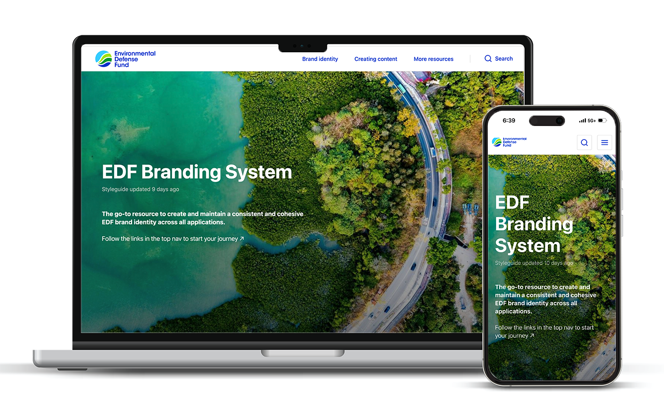
Owned the end-to-end creation of EDF's first online brand platform housing the complete branding system — overhauling and integrating all templates and brand style guides (core visual identity, iconography, photography, video, social, voice and tone, editorial) into a single, centralized destination that replaced a fragmented collection of PDF documents and assets.
Developed the project plan and creative brief, oversaw UX and information architecture, managed copy and design, and coordinated cross-functional stakeholders across marketing.
Launched with a full communication and training strategy to drive adoption organization-wide.
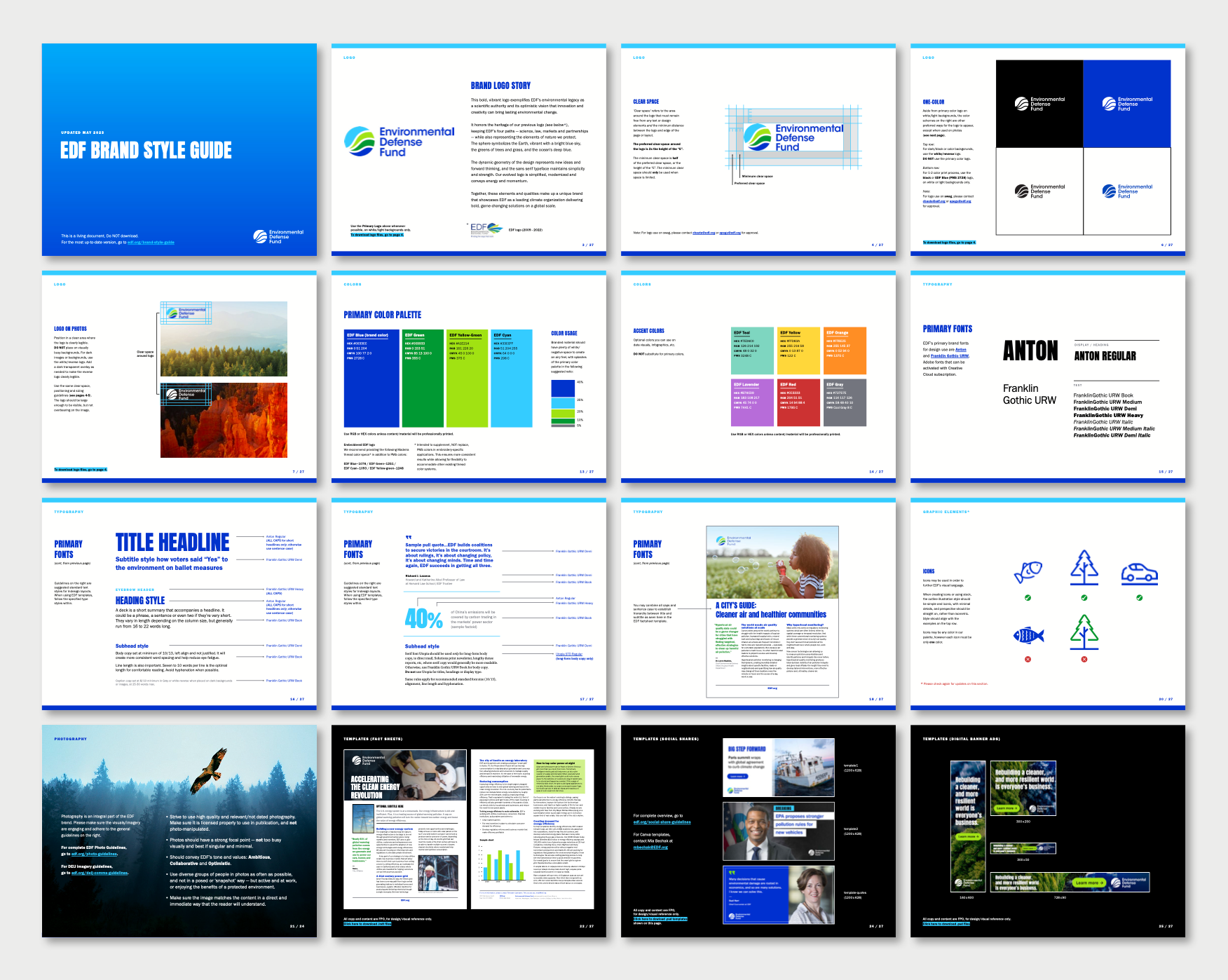
Brand Style Guide
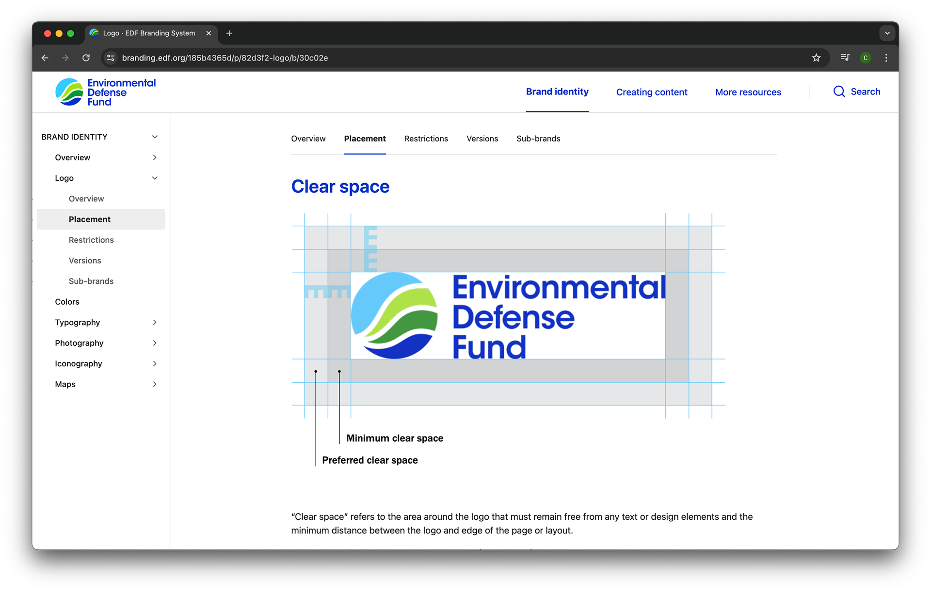
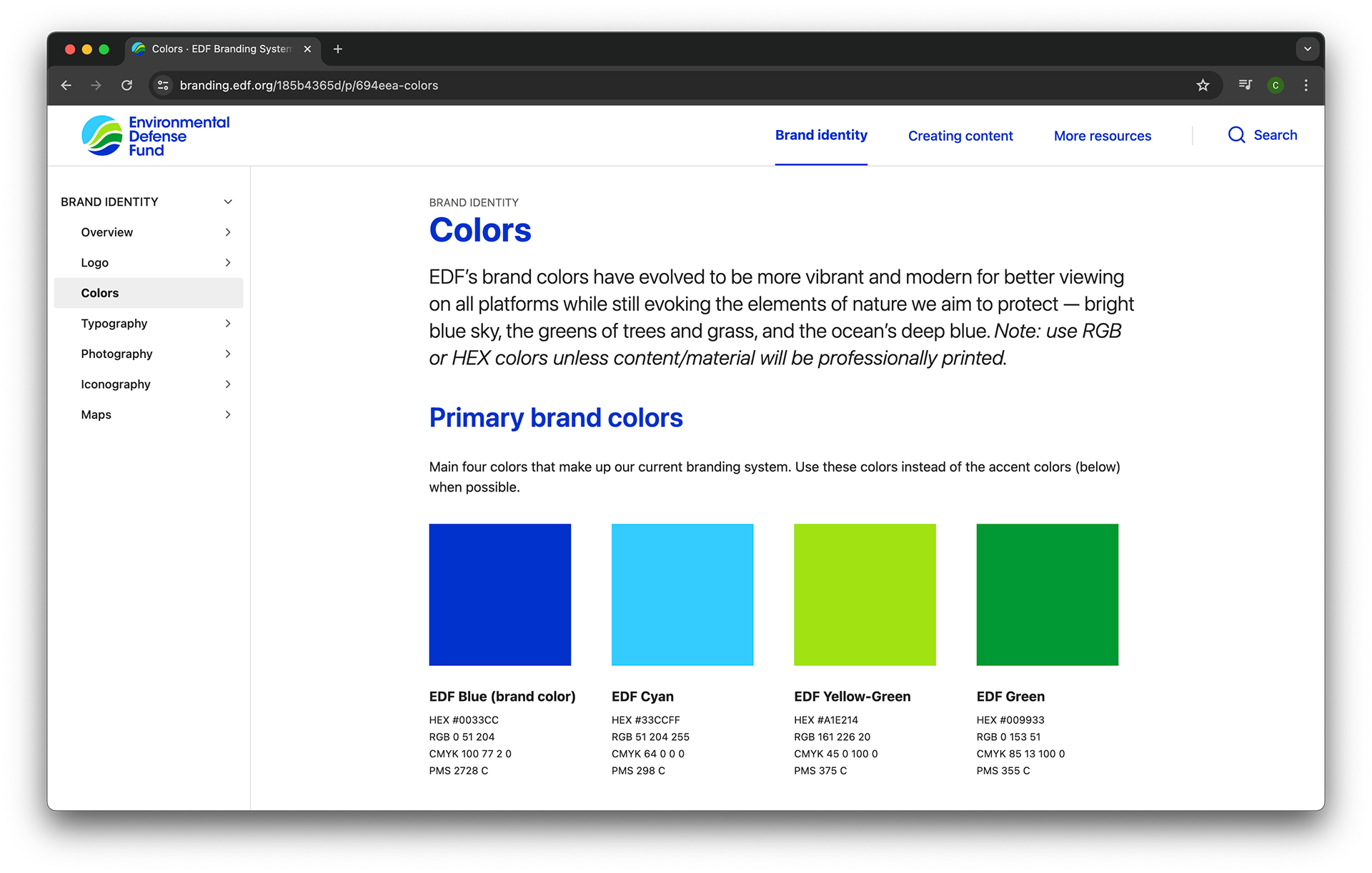
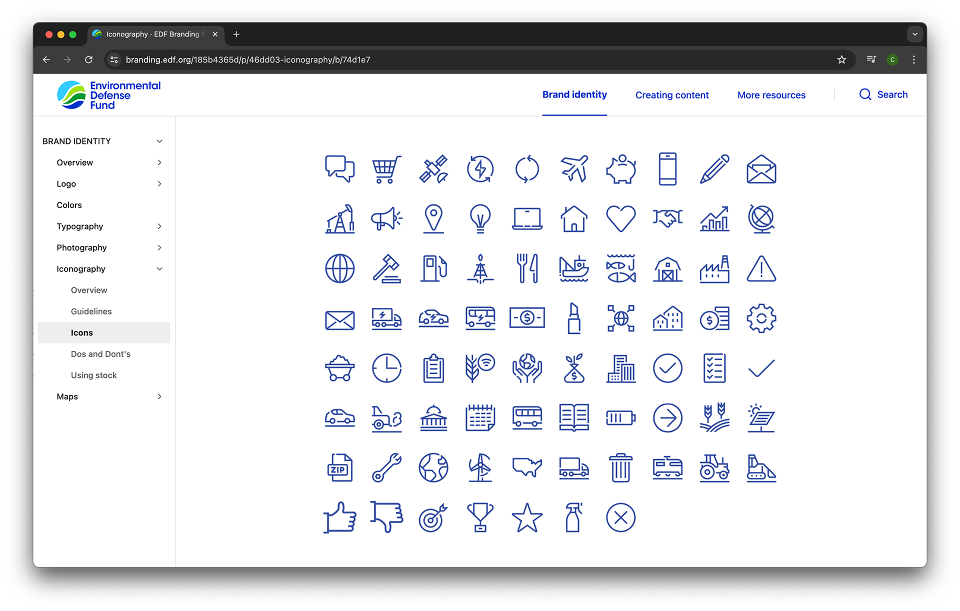
Created EDF’s comprehensive branding guidelines — detailing proper use of the logo, colors, fonts, icons, templates, etc — to ensure a cohesive brand identity. Oversaw creation of all brand assets.
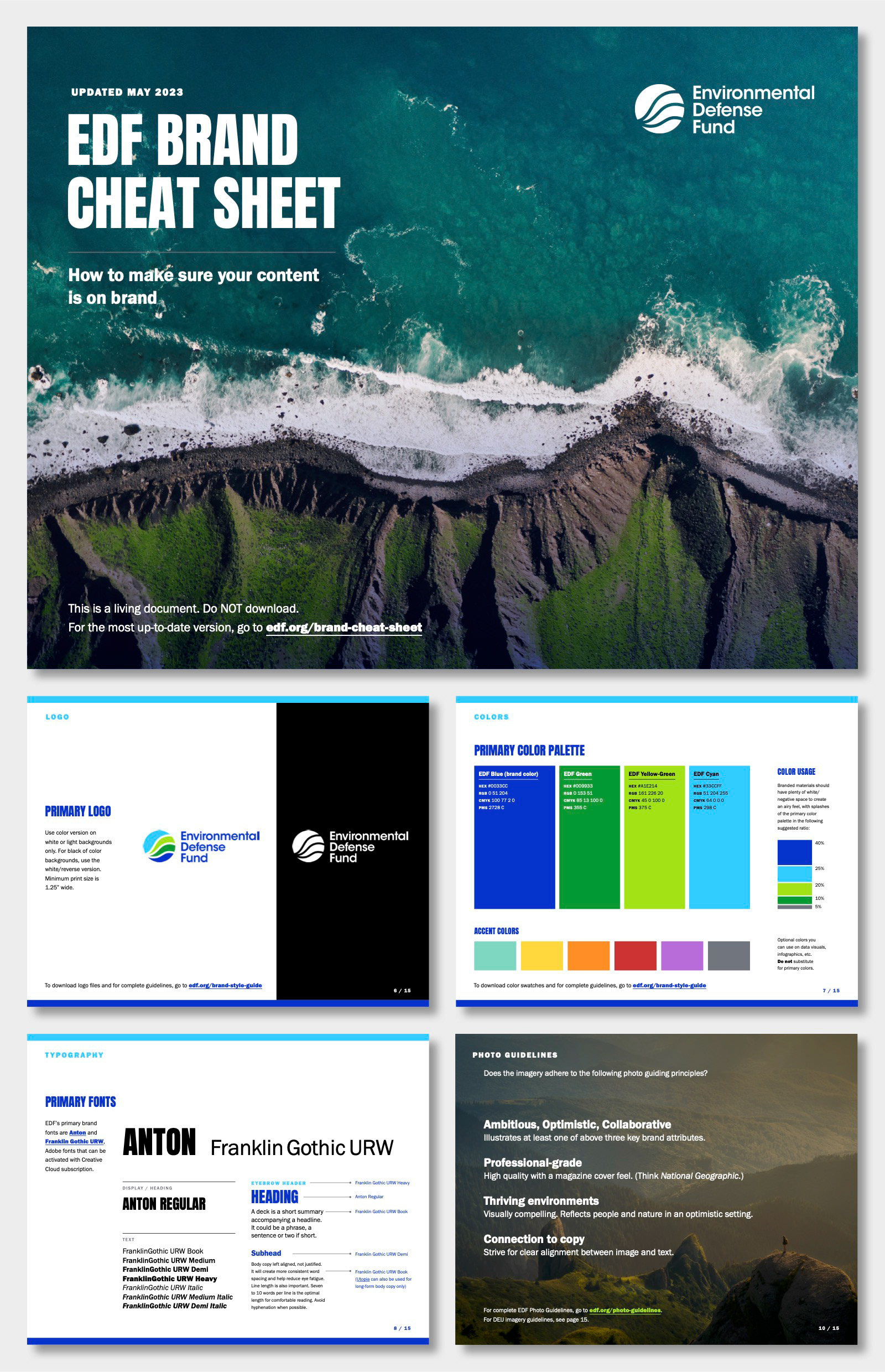
Brand Cheat Sheet
Quick-reference guide for staff to create on-brand content without digging into the full style guide. Covers brand attributes, editorial style, and template usage in a format anyone could pick up and use.